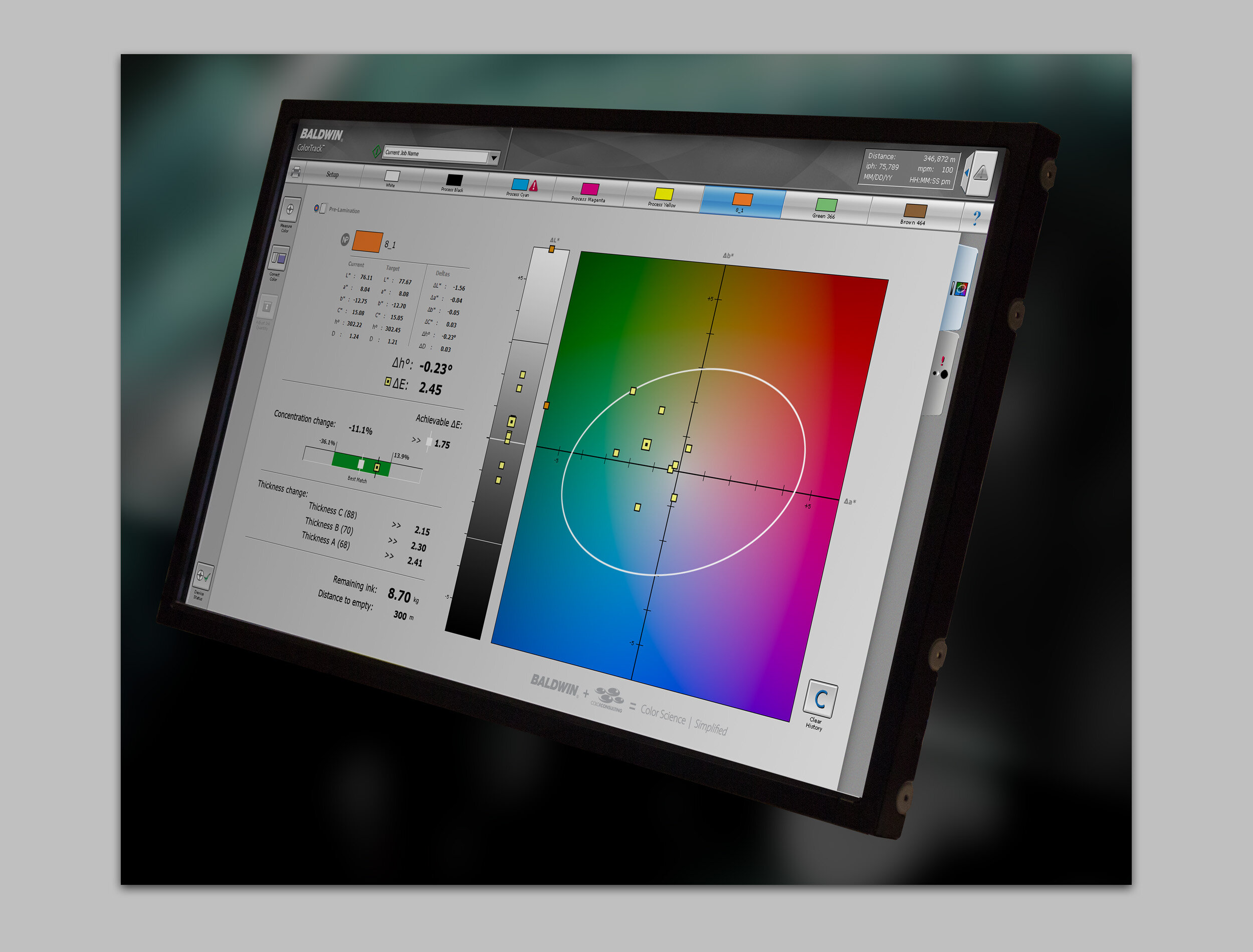
User interface design
Print is dead…right? Not so fast. True, you may not grab a daily newspaper on your way to the office, or bring a paperback to the beach. But all of us are surrounded by printed product that understandably escapes our attention.
Open your kitchen cabinet or refrigerator, almost everything you see has gone through a printing process. Order something online, and it will arrive in a cardboard box or envelope that’s been printed. The package inside the shipping package was printed on a press. And if your purchase was a pair of dress shoes, watch the avalanche of related product direct mail pieces that hit your old-school mail box for the next few months. Go to Walmart or Walgreens and throw a tennis ball (figuratively, please) and unless you hit the ceiling, it will likely hit something that was printed. Even if it hits the floor, that pattern in the flooring could very well have been printed.
Color accuracy in the printing process is essential to the end product being acceptable to the customer. The user interfaces below are designed for complex color management technology used to automate the printing process. In many cases, the users of the technology are not technical people. They need to operate an advanced control system without much training, and without wasting time as expensive substrate flies through the press.
Tools: Adobe Illustrator, Adobe Photoshop


